Abbotsford International Airport
Abbotsford International (YXX) is a regional airport that aims to be the competitive gateway to the region promoting economic growth for the community. They view themselves as an essential element for the Fraser Valley that provides employment opportunity to a significant number of the population, while providing opportunity for business through tourism and advertising.
Logo Rationale
The new logo design gives the viewer a strong feeling of the lifestyle that exists beyond the facility. It is achieved by using a colour palette and shapes that relate to the geography of the area. In detail, the magenta forms symbolize the agriculture and tulip fields that dominate the surface of Abbotsford, while the wavy blue shape symbolizes the Fraser River that runs through the city. Thirdly, the simplified chevron is symbolic of the aircrafts and of the airshow that is looked forward to every year by many who live and visit Abbotsford.
An update will provide a new look and feel to the brand that reflects growth and modernity, to match the drastic rise of passengers over the last 10 years.

Brochure
One goal of this re-brand was to tie in the airport with the tourism sector. Importantly, an airport is a gateway and a first experience to a new place; therefore, the graphic design must give the customer a strong feeling of the lifestyle that exists beyond the facility.
This brochure was designed to provide valuable information and images regarding the growth of the airport, as well as connect the consumer to the abundance of activities that Abbotsford has to offer.


Website Redesign
Another goal was to simplify and prioritize important information through the website re-design. All the most necessary information was moved onto the home screen along with easy navigation targeted towards either passengers or visitors.

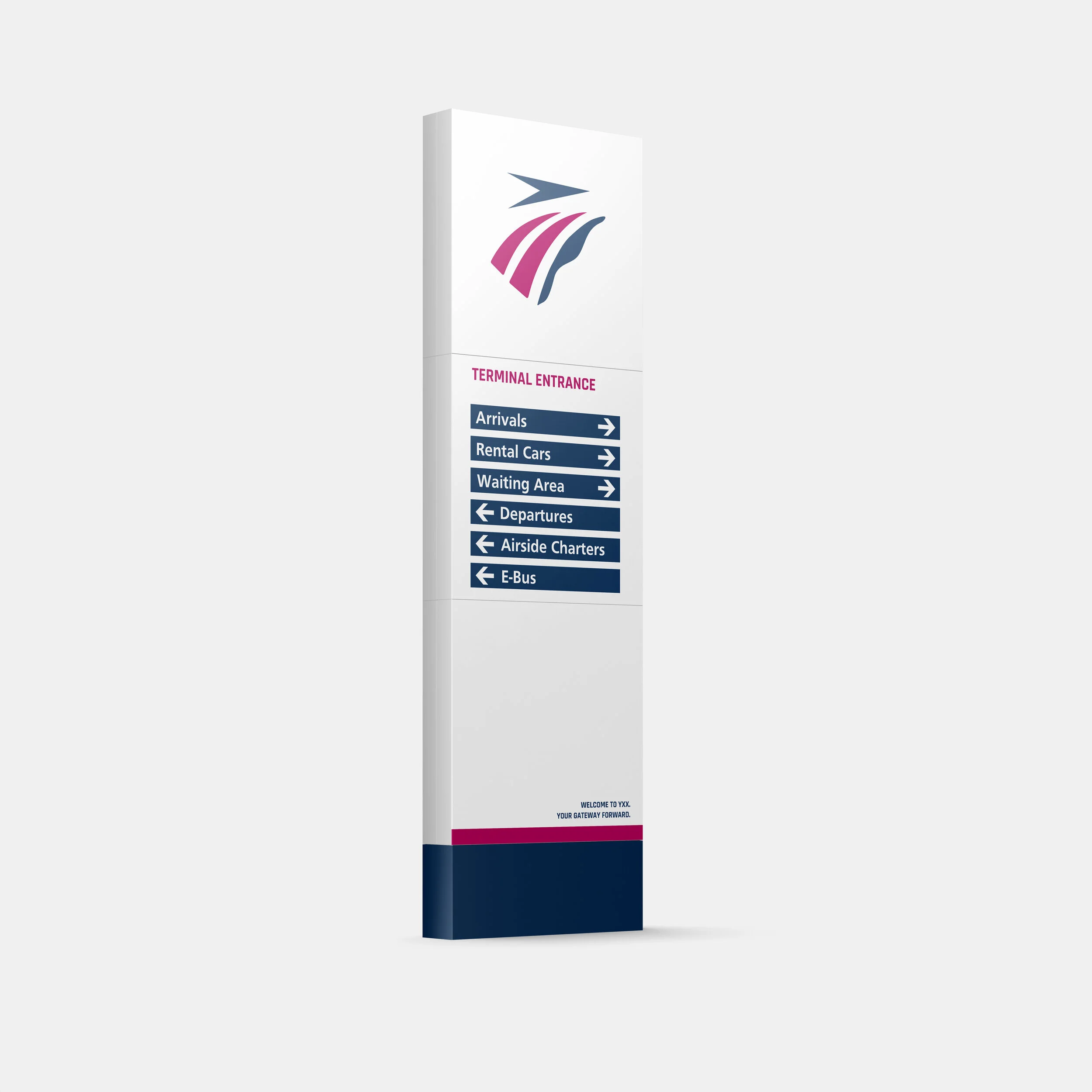
Wayfinding
The most impactful designs in airports result in how people move through the space in a comfortable and timely manner. Wayfinding was another aspect of this re-brand, and it came with a goal to create a strong, consistent visual language to help direct passengers to where they need to go.
The navy from the logo is used to back important symbols and information, while the magenta highlights priority information such as your terminal and gate.
Lastly, the agricultural forms from the logo design are incorporated into the iconography of the symbols to link the branding to the wayfinding system in a simple but effective way.

Departures

Arrivals

Connecting Flights

E-Bus

Luggage Carts

Baggage Claim